CSS keeps evolving with new capabilities that make our work faster, cleaner, and more powerful. Thanks to the latest browser advances (Baseline 2024), many fresh features now work across all major engines. Below are ten highlights you can start using right away.
Do you want more? Let’s check out my project, CSSToday: csstoday.dev/
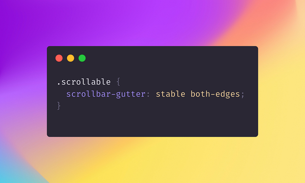
1. Scrollbar-Gutter & Scrollbar-Color
When a browser displays a scrollbar, the layout can shift as space is taken up. With scrollbar-gutter, you can preserve scrollbar space even before scrolling begins:
.scrollable {
scrollbar-gutter: stable both-edges;
}
You can also style your scrollbars with scrollbar-color:
.scrollable {
scrollbar-color: #444 #ccc;
}
This ensures a consistent look and prevents layout jumps.
What it’s good for ✅
scrollbar-gutter keeps layouts stable by reserving space for a scrollbar, preventing annoying shifts when the scrollbar appears.
scrollbar-color lets you style the scrollbar’s track and thumb, enhancing design consistency, especially for dark or themed UIs.
2. ::target-text
::target-text highlights text that’s reached by an internal link (for example, when clicking an anchor on the same page):
::target-text {
background: yellow;
color: black;
}
Readers immediately see the exact part of the text they’ve navigated to.
What it’s good for ✅
Highlights the exact text targeted by a link anchor, making it immediately clear where users have landed in long documents or articles.
3. Ruby Layout (ruby-align & ruby-position)
For certain languages and annotations, ruby-align and ruby-position are essential. They let you control how short annotations (ruby text) are placed relative to the main text:
ruby {
ruby-align: center;
ruby-position: over;
}
What it’s good for ✅
Essential for East Asian typography, allowing precise control of small annotations (ruby text) above or beside main text.
Also useful for inline annotations in educational or reference materials.
4. Relative Color Syntax & light-dark()
Modern color handling in CSS includes relative color syntax, which lets you adjust properties like lightness or saturation from an existing color. Additionally, light-dark() allows you to switch easily between light and dark color values:
.element {
background: light-dark(#ffffff, #000000);
}
You can also use <color-interpolation-method> to create smoother gradients in different color spaces.
What it’s good for ✅
The relative color syntax enables dynamic adjustments like saturation or lightness based on a reference color.
light-dark() simplifies toggling between light and dark color values, a common need for themes or dark mode.
5. Exclusive Accordions
Accordions typically require JavaScript to ensure only one panel is open at a time, but HTML’s <details> helps simplify this. Here’s a short snippet to keep panels mutually exclusive (https://developer.mozilla.org/en-US/docs/Web/API/HTMLDetailsElement/name):
<details name="exclusive">
<summary>Details</summary>
Something small enough to escape casual notice.
</details>
details {
border: 1px solid #aaa;
border-radius: 4px;
padding: 0.5em 0.5em 0;
}
summary {
font-weight: bold;
margin: -0.5em -0.5em 0;
padding: 0.5em;
}
details[open] {
padding: 0.5em;
}
details[open] summary {
border-bottom: 1px solid #aaa;
margin-bottom: 0.5em;
}
What it’s good for ✅
Allows you to show one panel at a time without complex JavaScript logic.
Ideal for FAQs, menus, or any scenario where only one detail should be open.
6. content-visibility
content-visibility skips rendering of off-screen elements until they scroll into view:
.lazy-load-section {
content-visibility: auto;
}
This reduces the initial rendering cost, improving performance on long pages.
What it’s good for ✅
Defers rendering of off-screen elements, boosting performance for long pages or complex layouts.
Improves speed and reduces memory usage, especially on mobile devices.
7. font-size-adjust
When a custom font isn’t available, browsers fall back to another font, often disrupting the layout. font-size-adjusthelps keep text size and readability consistent:
.text {
font-family: "CustomFont", Arial, sans-serif;
font-size-adjust: 0.5;
}
This maintains similar x-heights and legibility across font fallbacks.
What it’s good for ✅
Maintains consistent text appearance when custom fonts are unavailable or loading is slow.
Helps preserve readability and design by matching the x-height of fallback fonts.
8. transition-behavior
While transition-timing-function has served us well, transition-behavior introduces additional control over animations, such as reversing or pausing transitions without complex JavaScript. This paves the way for smoother UI interactions and advanced animation scenarios.
.card {
transition-property: opacity, display;
transition-duration: 0.25s;
transition-behavior: allow-discrete;
}
.card.fade-out {
opacity: 0;
display: none;
}
What it’s good for ✅
Expands on basic transitions to offer reversible or more complex transitions without heavy scripting.
Useful for refined UI effects, interactive components, and unique animation scenarios.
9. CSS @property & Stepped Value Functions
@property makes it possible to declare custom properties with predefined syntax, inheritance rules, and initial values:
@property --animation-progress {
syntax: "<number>";
inherits: false;
initial-value: 0;
}
You also get new stepped value functions like round(), mod(), and rem() for calculations directly in CSS, eliminating many JavaScript or preprocessor hacks.
What it’s good for ✅
@property turns custom properties into fully declared variables with types, defaults, and inheritance rules.
Functions like round(), mod(), and rem() enable straightforward math in CSS, reducing reliance on preprocessors or JavaScript.
10. offset-position & offset-path
For more complex motion design, offset-position and offset-path let you animate elements along a custom path without heavy JavaScript frameworks:
.move {
offset-path: path("M10,80 Q95,10 180,80");
offset-position: 0%;
transition: offset-position 2s ease;
}
With these properties, you can create polished animations guided by SVG paths or simple curves.
What it’s good for ✅
Allows path-based motion and animation purely in CSS.
Great for interactive elements, motion graphics, or guiding user attention along curved trajectories.
Conclusion
Each of these features is already supported in all major browsers. They remove the need for many JavaScript workarounds and let you build layouts and interactions that are simpler, faster, and more maintainable. Try them out and see how they can elevate your projects to a new level of efficiency and elegance. Have fun experimenting!
Do you want more? Let’s check out my project,
Comments
Post a Comment